Me going crazy trying to unpack my thinking bit by bit after last week's studio.

After a week's challenging contemplation on my three studies, I took a step back and worked more closely with the dimensions of the house specifically the plan. This is to hone down my understanding of the major parts of the house and the circulation, as last week's studies did not portray succinctly what I was attempting to represent. My third study windows as a formal device, I found was the only analysis which tied in closely to the essence of the house and so I just furthered sharpened my understanding of this by combining it with the major and minor axes of the house.
-Public and Private Spaces
Isolating the spaces within the house, I arranged the rooms into a hierarchy of areas (smallest area to the largest), spreading out the U-shape into a linear line of progression and also sectioning the house in accordance to how the rooms are approached (in other words cutting the house in the way which the user circulates through it from entrance to rooms). My apologies for the photos being too dark, I will be producing the drawings in CAD for the final submission, mounting these drafts on foam core for presentation.
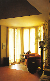
The drawings above, I feel is a more appropriate medium for representing how the house's varying roof heights define what is a public, semi-private and private space. With my decision to extract the external walls, leaving only the floor slab and the roof, I can now see that the significant spaces within the house are separated from each other using a lower height ceiling for what can be referred to as the services. However, when organising the spaces in terms of its area then sectioning these, the anomaly which repeatedly appears is the lowered roof height in a certain part of the living room. Looking at the images below, the furnishing in the living room seem to be arranged around the lowered ceiling area with some furniture placed in the centre facing the fireplace. After a week of trying to understand this, my tutor and I came to the conclusion that it is best to show this anomaly rather than trying to extrapolate the reasoning behind it.
-Circulation of the house
First I tried to unravel the geometries within the house then decided on concentrating what is directly connected to the circulation. I realised that the fragmented arc of the children's bedrooms did not have any direct relationship to the circulation of the house but rather dictates the path of the garden wall which penetrates the house. After that, I took only the major and minor axes of the house and compared it to the circulation and noticed that the major axis dictates the the movement through the public wing of the house and the minor axis dictates the access through the private wing of the house. The public and private wing also has very distinctive circulation patterns- the public wing requires one to move through rooms instead of corridor to rooms like the private wing.
-Windows as a formal device
The photo below is the form of my window analytical model, taking into account the major axis. This includes the bay window in the living room and the false perspective formed by the window in the hall and the opening of the internal courtyard.
The first photo is my progress so far in comparison to the last two weeks. For this week the model in the middle is what I created just to resolve the views which I'm trying to capture. However, there is the case in which I have to resolve the fireplace in one of the views into the model, somehow trying to connect the front bay window to the window in the hall.
My progress this week, I feel tied in more closely with the essence of the house and felt less distorted or disconnected to what I am actually seeing, rather than understanding. The key was to work with the plans and sections rather than understanding the idea as something that is separate from what exists in plan or section.


No comments:
Post a Comment